It had been decades since I read Charles Dickens’s “Hard Times”, and it was probably a forced read at the time.
There’s a line I ‘sort-of’ remembered, but looked it up to quote it: “It was a town of red brick, or of brick that would have been red if the smoke and ashes had allowed it…” (There’s more that feels politically incorrect now in an antiquated manner–comparing the town of Coketown to the “painted face of a savage”, but what I was drawn to was the ‘brick that would have been red.”)
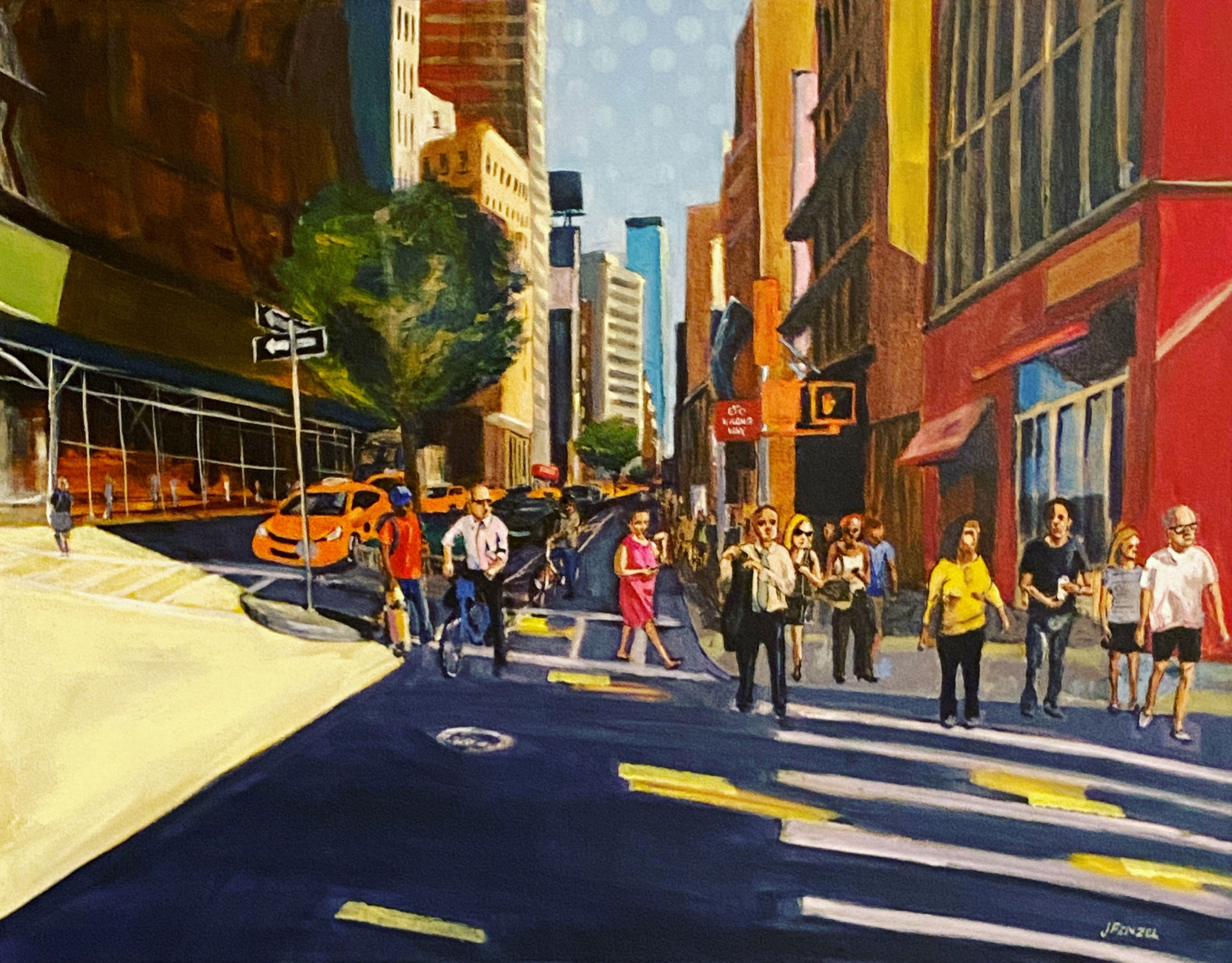
I paint urban scenes, spots of time, narrative little clips in the midst of the city’s bustle and din. I use a bright acrylic palette and colors that would not render in a photograph of a scene I’m painting. The sunlight brightens the asphalt to a yellow hue, the buildings cast purple shadows, the cantilevered span of the Queensboro Bridge is more orange than the actual buff color of “Queensborough Tan.”

It’s a city of bright colors, or colors that would have been bright if the smoke, congestion, grime, neglect, had allowed it.
It’s the color you experience if not the one your eyes see.